Photo Evaluation -

|

|
What has the artist/photographer chosen to include in the composition? What might be excluded?
The first image portrays a bunch of rubble. I can see steep hills aswell as a lot of dust, there’s not really a lot going on but this could be interesting in different aspects. I think some things that may have been excluded is the scenery that this messy mountain had to offer behind it (trees, clouds).
The second image displays a frame 'straight from a movie scene'. They included different variations like the levels and layering of the mountains and a midnight aura surrounding the man and his stable. One thing they might have excluded was the natural light.
What relationship might the artist/photographer have to the landscape depicted?
The first image may show a rocky relationship with the artist since everything is very steep and plain. There are small details like the barely visible pathways which can show the deep thinking within the photo.
The second image emphasises a more energetic and cooler scenery. Everything looks like it is animated. It's almost as if like you are watching a movie and pause it at the perfecting timing (coolest scene in the whole show). I think the relationship with this image can be resembled as a 'good friend' aswell with all of the history behind it and how long ago it was made (1987) ; this can display a strong friendship.
What is the vantage point from which we are looking at the landscape?
For our first candidate, the viewpoint is pretty low. I'm assuming that this is because they want to catch more detailing into the frame, since there is almost nothing to admire. For our second candidate, the viewpoint we are witnessing from looks pretty straightforward. I think this is so that the artist can record every moment that has happened in this singular second. If they took this picture in any other angle like a high viewpoint, it would not capture the goal of what the photographer wanted.
How distant or close are we to the landscape?
Roger Fentons image is kind of far. You can see the whole slope that the artist wanted to include, even though theres not much detailing to it.
Richard Prince's image is way more up-close. I think he did this to capture more detailing; the shading of the smoke and the shadows around the area.
What ideas, feelings, or moods are communicated by the choices the artist has made about the way the landscape is presented?
I think the mood for the first image is kind of just like empty thoughts. It's like going into and having time to think to yourself. It's really plain but it's also really old (nearly 200 years old) so I think it has a bit of history behind it.
I think the mood for the second image is more dramatic. There's a lot of action like the man running quickly; it looks like he is running like he is about to attack.
My 36 images -


Image Evaluation -
Back to the future -

|

|
What kind of landscapes do they describe?
I think the landscapes that these images may describe is like a naturalistic area. Both images resemble something to do with nature; like image 1 shows us a beach with violent waves whilst image 2 shows this rocky type of 'wall'.
What similarities do you notice about these two photos?
The similarities between these two images is the rocks. They display the rocks in a very powerful way. They look very powerful because in image one it looks like it is defending itself from natures powerful catastrophes whilst image two is covered in rocks to show its strength being number one.
What differences do you notice?
The differences that I notice between these two photos is that one of them is more detailed than the other.
1. - displays destructive waves, camera makes it look like it's been taken nearly a century ago but that adds up the mysterious aura to it.
2. Reminds me of zooming in on something with a microscope
What words best describe this Landscape?
1. Sunny, happy, energetic, vibrant, vintage
2. Modern, naturistic, sturdy, strong
In which of these landscapes would you prefer to live?
In my opinion, I would prefer to live in the first photo. I like areas that have a lot of nature in it. Imagine if you lived by the seaside and heard the beautiful sound of waves and birds singing everyday. I like that so that's why I prefer to live there
However the second photo could be a 'zoom-in' into some modern mansion with 50 rooms even if it was like that; I wouldnt want to live there because I prefer more countryside stuff instead of being surrounded by 'tall robot' in a city where no one is really happy.
Minimalistic Landscapes -
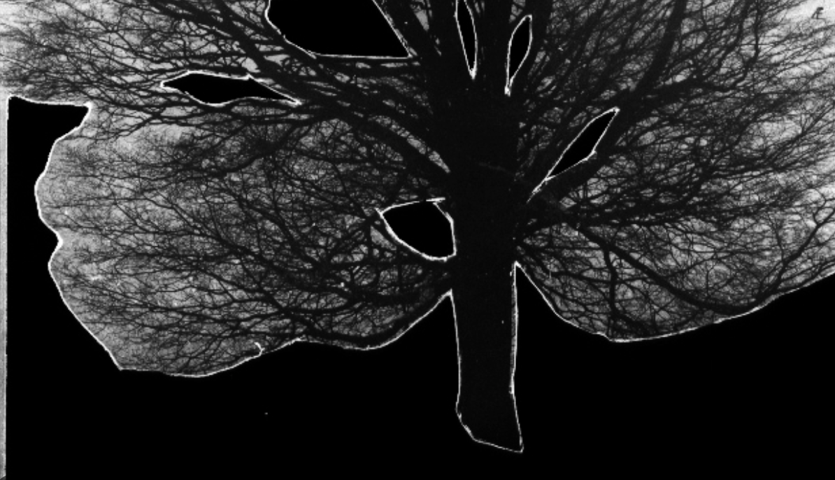
Geraldo De Barros - from the series Sobras, 1996
|

Liz Nielsen, Gardening With You, 2020, Photogram
|
In Geraldo's image, I can see this big oak tree. It looks like it has been taken out of the original photograph and placed into another image. I can notice many patterns within the tree and a variation of opacities. I think what is missing from this landscape is its natural aura; the viridescent grass. In Liz's image, I can see what looks like a big tree and a cluttered staircase. It doesn't have much to it, black and white. No colours but it looks interesting since you can view the image in different ways since it won't look the same for everyone. I think what I would say is missing in this image is different shades, you can keep the images in a black and white scheme but also add shading to it; this will make it stand out and more interesting. What I found unusual about Geraldo's image is that there is only a singular tree and nothing else. In my perspective, I wouldn't see it as cool as all the other images because it does not have much to it.
What I found surprising about Liz's image is that I can't tell if she made this piece on computer or real life. I feel like there needs to be more to them. My emotions aren't really interested in what I am seeing so I feel a bit bored. Although the main purpose of these images is supposed to be 'basic', I feel like this is too basic for me. For Geraldo's image, I would take a picture of a big oak tree. Then I would cut out the tree and put the photograph on photoshop and make the image have no saturation. For Liz's image, I would just draw it out with accuracy. I think they have done this to make the images stand out. The tree looks like the king of the photo because of how much it stands out. The 'smaller tree' in the second photo makes the photos purpose look more naturistic. I prefer Liz's image. It has different features. It looks very modern and neat. I wouldn't choose Geraldo's image because it looks kind of messy to me.


